Match the logo process to the paper, colour and customer experience instead of choosing a finish in isolation.
Fast answer
- Foil creates reflective contrastBest when metallic colour and a precise highlight support the brand.
- Embossing creates tactile depthA restrained design usually produces the cleanest raised or recessed result.
- Spot UV creates gloss contrastParticularly effective on dark, matte or softly textured surfaces.
A logo finish should support the material and brand system rather than compete with them. Foil stamping, embossing, debossing and spot UV each create a different visual and tactile result.
Foil stamping: reflective contrast
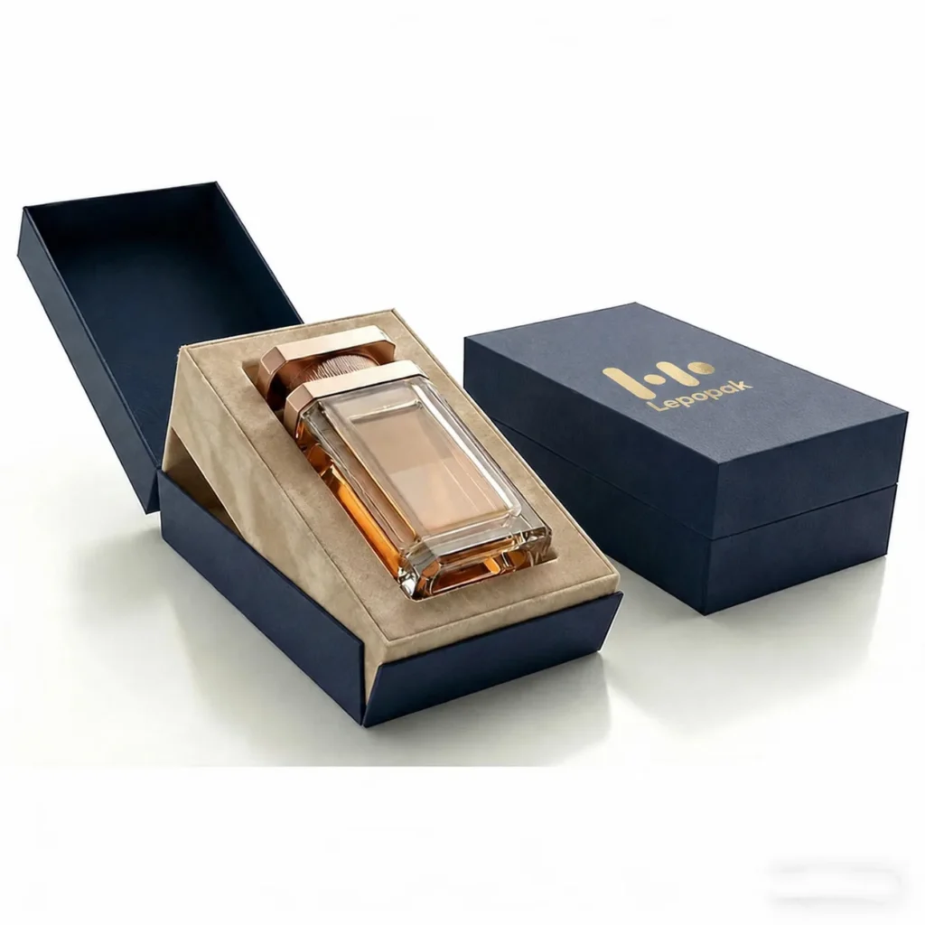
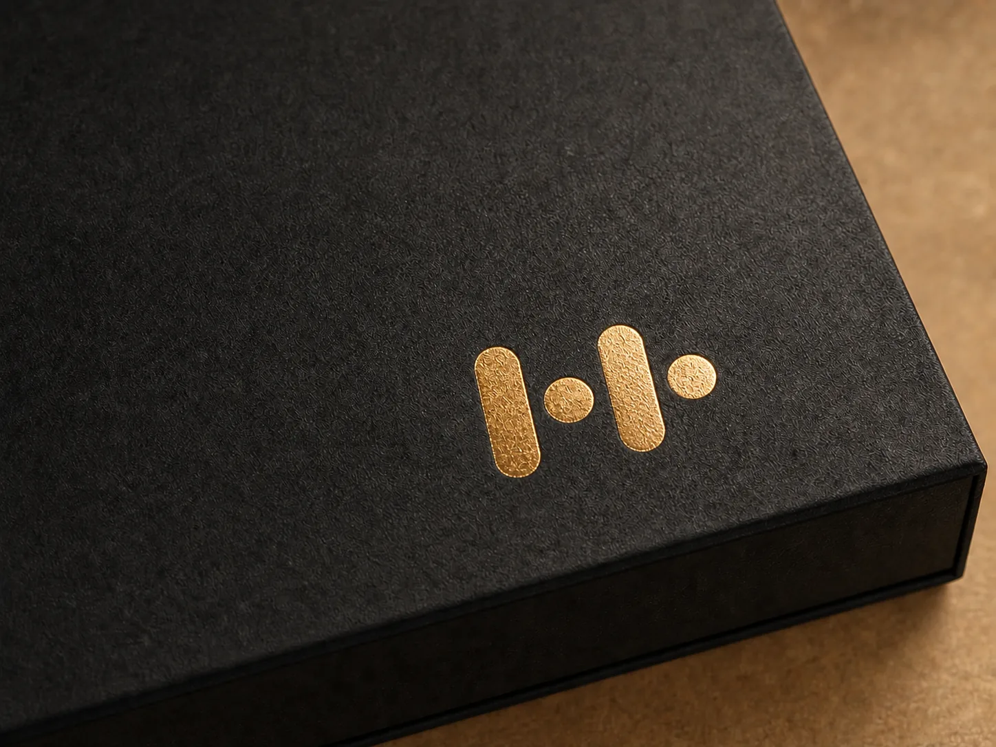
Foil is useful when a logo needs a clean metallic highlight. Gold and silver are familiar choices, while custom colours can create a more distinctive result. Fine lines, paper texture and the stamping area all affect consistency.
Embossing and debossing: physical depth
Embossing raises the artwork and debossing presses it into the surface. Both rely on pressure, tooling and suitable material. They are especially effective when the design can remain simple and the tactile detail is part of the brand experience.
Spot UV: gloss against matte
Spot UV creates contrast by adding gloss to selected areas. On dark or matte surfaces it can be subtle and modern. Registration accuracy and the underlying paper or lamination need to be checked in a physical sample.
How to choose
- Choose foil when reflective colour is important.
- Choose embossing or debossing when touch and depth carry the idea.
- Choose spot UV for restrained gloss contrast on a matte surface.
Approve a real sample, not only a screen proof
Digital artwork cannot reproduce the way light moves across foil, the depth of an embossed mark or the gloss of spot UV. Approve the finish on the intended paper and colour before mass production.